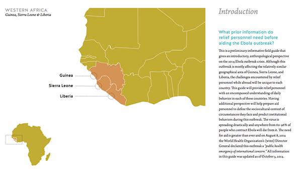
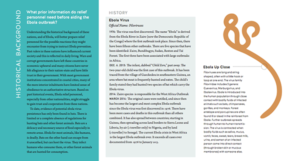
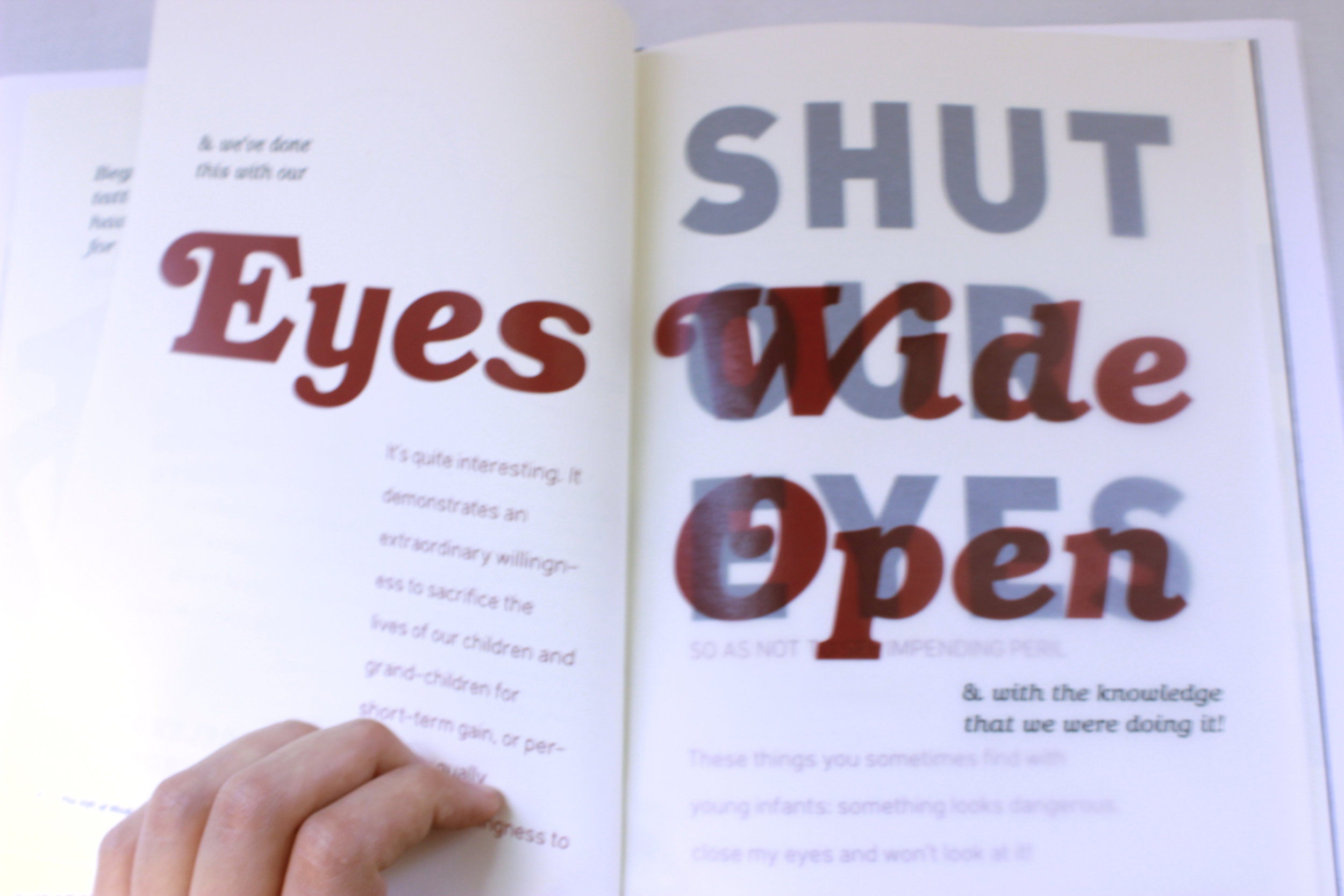
Color Palette
A color palette was defined and helped with the challenge of creating a cohesive package of graphical elements. The icons are restricted to the 16 colors in the color palette not including white.
Anzo Color | Specific Color Use
The entire palette can be used universally across all the Cambridge Semantics products. Regulations for the color palette should be applied as described.
(primary palette)
Should dominate visually, made up of white, monochromatic increments of gray and Anzo teal. These colors anchor and balance color expressions when used with secondary and extended palettes
(secondary palette)
These colors span the color spectrum. Providing more variety to enhance visual communications
(extended palette)
Applied minimally to subtly call out, accentuate, highlights important nuances for the user.
Gradients
Gradients are restricted to the 4 analogous, duotone color transitions. I chose them to add dimension and depth to the flat design. They are applied with the darker color to the right and lighter color to the left to produce the illusion of a light source which emphasizes movement and energy.
*Challenge/Take Away: When testing SVG icons with the gradients in the dev environment they did not behave as designed. It was quickly determined that SVG’ s with gradients did not adapt for web without the addition undertaking from the developer to manually code the style for each gradient.