

Anzo Smart Data Lake screens, captured from Demo Video
Anzo Software
Graphical Elements
Client Cambridge Semantics Inc.
Role Visual/UI Design Contractor
Discipline Illustrator, System Design,
Branding, Technical Design, SVG & PNG
Duration 10 months
“Cambridge Semantics Inc., The Smart Data Company®, is an enterprise Big Data Management and Exploratory Analytics software company. The Anzo Smart Data Lake® solution, allows IT departments and their business users to semantically link, analyze and manage diverse data whether internal or external, structured or unstructured, with speed, at big data scale and at a fraction of the implementation costs of using traditional approaches.”
At Cambridge Semantics, I was responsible for the graphical elements in the ‘Anzo Smart Data Lake’ software. Under the management of the User Experience Designer, Zoe Monosson, I helped define the cosmetic experience of Anzo creating the logo and 200+ icons and visual elements. In this role, I was introduced to the Agile and SaaS development processes as well as the Atlassian products, Confluence and Jira. It was during this time period I decided I wanted to pursue my career in product design.
Logo | Finding Balance
The primary size constraint when creating the Anzo Logo was that its placement needed to be clearly visible in the top left navigation bar of the software.
After exploring with pen and paper I naturally started to leverage inspiration from the graphic feature, ‘linking circles’ found in the companies existing logo. I began making the ‘O’ in Anzo, as one of the linking ‘perfect’ circles. From this point I struggled to find an existing geometrical front that looked balanced when paired with the remaining letters ‘A’, ‘N’ and ‘Z’.
Cambridge Semantics Logo 2017
Contrary to it’s appearance, the letter ‘O’ is not a perfect circle. When horizontal and vertical strokes are the same thickness for letter, the horizontal strokes will look heavier. To prevent this, all letters are designed to be optically adjusted. Moving forward, in order to keep the ‘O’ in Anzo a perfect circle I had to create my own modified, vectored letters for the ‘A’ ‘N’ ‘Z’ letters to achieve balance.
When creating the three linking ‘O's, I also had to be carful that the logo did not accidentally read ‘Anzooo’
Anzo Logo
Conference Booth Design Data Summit 2017
Logo on Apparel
Color Palette
A color palette was defined and helped with the challenge of creating a cohesive package of graphical elements. The icons are restricted to the 16 colors in the color palette not including white.
Anzo Color | Specific Color Use
The entire palette can be used universally across all the Cambridge Semantics products. Regulations for the color palette should be applied as described.
(primary palette)
Should dominate visually, made up of white, monochromatic increments of gray and Anzo teal. These colors anchor and balance color expressions when used with secondary and extended palettes
(secondary palette)
These colors span the color spectrum. Providing more variety to enhance visual communications
(extended palette)
Applied minimally to subtly call out, accentuate, highlights important nuances for the user.
Gradients
Gradients are restricted to the 4 analogous, duotone color transitions. I chose them to add dimension and depth to the flat design. They are applied with the darker color to the right and lighter color to the left to produce the illusion of a light source which emphasizes movement and energy.
*Challenge/Take Away: When testing SVG icons with the gradients in the dev environment they did not behave as designed. It was quickly determined that SVG’ s with gradients did not adapt for web without the addition undertaking from the developer to manually code the style for each gradient.
Visually Simplify Complex Data Features
A majority of my time I spent talking out and sketching concepts for iconography that would best visually capture the data ingestions process. While working on this project the functionality of the software was evolving, The company was developing a cutting edge one-stop-shop for data ingestions and I was designing along with ideation. This was my favorite part of the whole process! In order to do this I learned a great deal about big data, its terminology, the different kinds of data and common ways data can be ingested and broken down.
Vocabulary
Datasource
The location of where your data is coming from (i.e. database, csv, etc).
Data Connections
A data connection is where you identify
which data sources you want to upload into the data lake.
Dashboard
A group of visualizations that allow the user to gain insight and meaning from their data.
Mapping
Shows the relationship between the
schema and the ontology.
Provenance Explorer
Where you can see the history/lineage
of your data.
Graphmart
A group of datasets that can used to create dashboards from.
Dataset
Is multidimensional data that has been ingested into the data lake.
Ontology
An Ontology is used to define the concepts, attributes, and relationships for a specific subject domain.
Schema
A replication of the data source’s structure and is basically a description of what the data looks like.
Ingestion Project
A project is a group of jobs. A job is the configuration that connects the data that you want to where you want to load it. Once a job is published, the data will get loaded into the desired location.
File System Location
The location where you are pulling data from (i.e. your computer, a database, etc). This is configured by an admin and data ingestion users would not interact with this section of the UI.
High level description of data ingestion
Data ingestion and harmonization enables users to quickly upload and map data from any source
Preliminary Data Ingestion Process
As a started to learned more about the stages of data ingestion, I then began setting up my art boards in the same order.
Optimizing for Web
SVG’s have code attached to them, the more points, layers, and elements they have, the more code they have. To prevent lagging and improve loading time on a page it’s best to have as little code as possible. Steps for optimizing to reduce code included, making sure I was using minimal points in Adobe Illustrator, removing guides, and ungrouping and removing all hidden elements underneath each vector. One way to check if there were hidden elements is to turn the view to an outline view in illustrator.
Outline View in Illustrator
Technical Issues
A major challenge at first was creating illustrator files that would efficiently supported on-going alterations for exporting 200+ individual elements based on developer specifications.
For alignment, instead of using guidelines, which are not good for optimization, I took full advantage of the background grid.
Testing
To test icons I had two options. I either photoshopped them into screenshots of the interface or I would have them sent to the QA environment. Testing in the QA environment was most important for the monochromatic glyph icons. The glyph icons are created with an emphasis on simplicity because they appear much smaller than the rest of the colored icons. When testing them in QA, it became apparent that they needed to have a larger width than height.
Exporting
The art board panel was extremely useful. The name of each art board become the name of the icon. The names would carry over when I exported and handed them off to the developer. It also helped everyone involved know exactly which icon was being discussed, tested or needed to be modified. This become critical as the collection of icons grew. As a result of this project I came to learn that illustrator can only handle a maximum of 100 art boards in one file, and I ended up needing to make multiple Illustrator files to handle all of the icons.


Even though the name carried over from the art boards when exporting, so did the name of the file which would be the beginning of every singe icon. I would normally name the file a single character like ‘1’ so that I would only have to remove ‘1-’ at the beginning of each icon before handing them over to development to test. Eventually this step in the process became extremely cumbersome so I created a batch scrip on my computer that would remove the first two character of each icons name. This saved me loads of time.
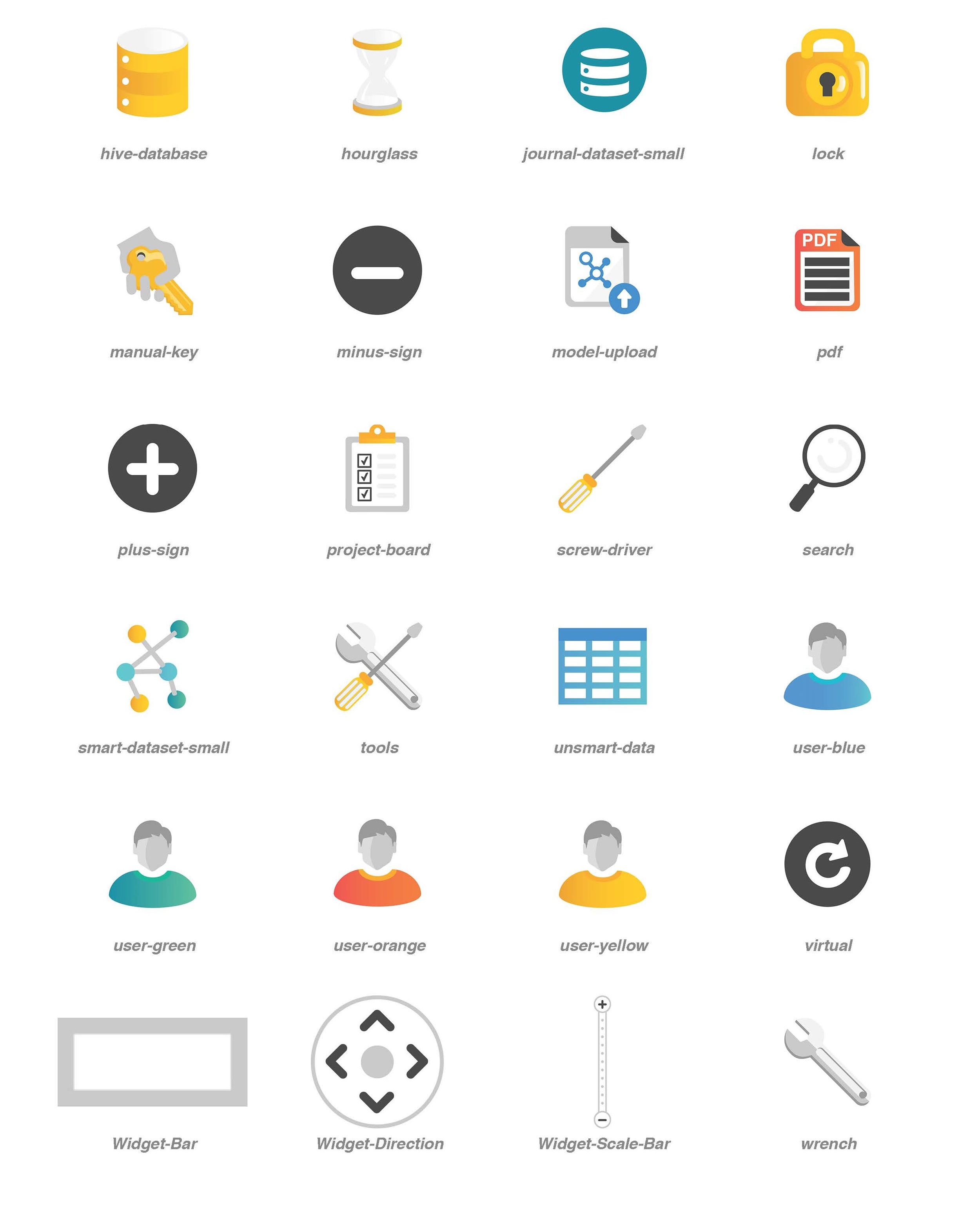
Anzo Smart Data Lake Flat Icons
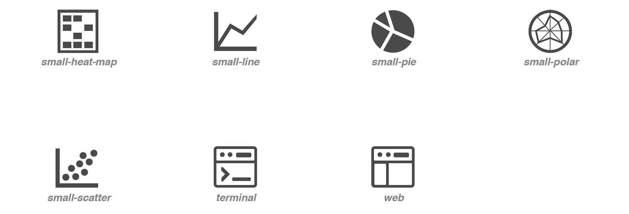
Anzo Smart Data Lake Glyphs
Anzo Graph Icons
Anzo Graph Glyphs
Other Flat Icons
Other Glyphs


